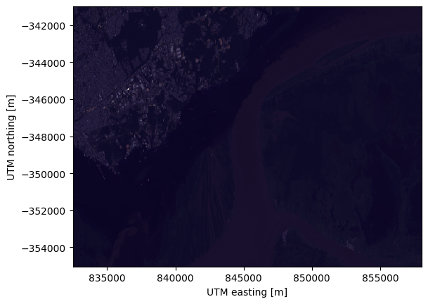
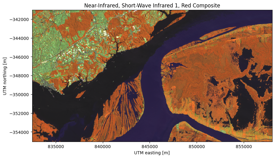
<xarray.DataArray 'composite_red_green_blue' (northing: 468, easting: 851,
channel: 4)> Size: 2MB
array([[[ 13, 10, 39, 255],
[ 13, 11, 39, 255],
[ 13, 11, 39, 255],
...,
[ 17, 14, 41, 255],
[ 15, 13, 40, 255],
[ 15, 13, 40, 255]],
[[ 13, 10, 39, 255],
[ 13, 10, 39, 255],
[ 13, 11, 39, 255],
...,
[ 17, 14, 41, 255],
[ 16, 13, 41, 255],
[ 16, 13, 41, 255]],
[[ 13, 10, 39, 255],
[ 13, 11, 39, 255],
[ 13, 10, 39, 255],
...,
...
...,
[ 23, 14, 41, 255],
[ 23, 14, 41, 255],
[ 23, 14, 41, 255]],
[[ 31, 24, 55, 255],
[ 30, 22, 52, 255],
[ 32, 25, 57, 255],
...,
[ 23, 14, 41, 255],
[ 23, 14, 41, 255],
[ 23, 14, 41, 255]],
[[ 29, 23, 54, 255],
[ 30, 22, 53, 255],
[ 31, 22, 52, 255],
...,
[ 23, 15, 41, 255],
[ 23, 14, 41, 255],
[ 23, 14, 41, 255]]], dtype=uint8)
Coordinates:
* channel (channel) <U5 80B 'red' 'green' 'blue' 'alpha'
* easting (easting) float64 7kB 8.325e+05 8.325e+05 ... 8.58e+05 8.58e+05
* northing (northing) float64 4kB -3.55e+05 -3.55e+05 ... -3.41e+05 -3.41e+05
Attributes: (12/20)
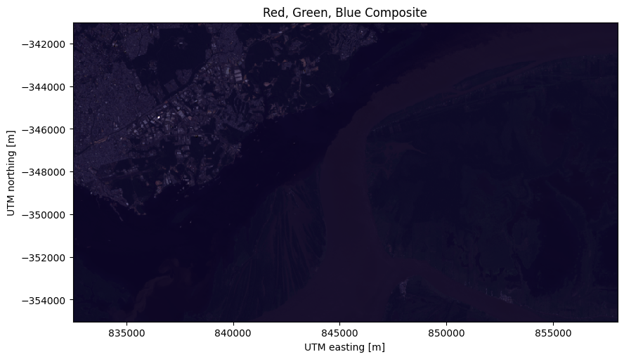
long_name: red, green, blue composite
Conventions: CF-1.8
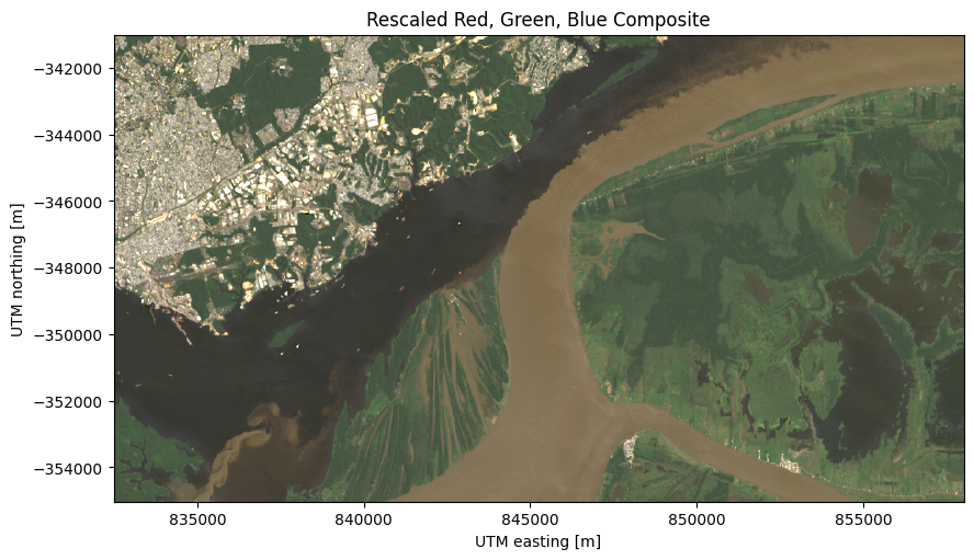
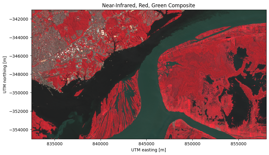
title: Landsat 9 scene from 2023-07-23 (path/row=231...
digital_object_identifier: https://doi.org/10.5066/P9OGBGM6
origin: Image courtesy of the U.S. Geological Survey
landsat_product_id: LC09_L2SP_231062_20230723_20230802_02_T1
... ...
ellipsoid: WGS84
date_acquired: 2023-07-23
scene_center_time: 14:12:31.2799050Z
wrs_path: 231
wrs_row: 62
mtl_file: GROUP = LANDSAT_METADATA_FILE\n GROUP = PROD... 13 10 39 255 13 11 39 255 13 11 ... 41 255 23 14 41 255 23 14 41 255
array([[[ 13, 10, 39, 255],
[ 13, 11, 39, 255],
[ 13, 11, 39, 255],
...,
[ 17, 14, 41, 255],
[ 15, 13, 40, 255],
[ 15, 13, 40, 255]],
[[ 13, 10, 39, 255],
[ 13, 10, 39, 255],
[ 13, 11, 39, 255],
...,
[ 17, 14, 41, 255],
[ 16, 13, 41, 255],
[ 16, 13, 41, 255]],
[[ 13, 10, 39, 255],
[ 13, 11, 39, 255],
[ 13, 10, 39, 255],
...,
...
...,
[ 23, 14, 41, 255],
[ 23, 14, 41, 255],
[ 23, 14, 41, 255]],
[[ 31, 24, 55, 255],
[ 30, 22, 52, 255],
[ 32, 25, 57, 255],
...,
[ 23, 14, 41, 255],
[ 23, 14, 41, 255],
[ 23, 14, 41, 255]],
[[ 29, 23, 54, 255],
[ 30, 22, 53, 255],
[ 31, 22, 52, 255],
...,
[ 23, 15, 41, 255],
[ 23, 14, 41, 255],
[ 23, 14, 41, 255]]], dtype=uint8) Coordinates: (3)
channel
(channel)
<U5
'red' 'green' 'blue' 'alpha'
array(['red', 'green', 'blue', 'alpha'], dtype='<U5') easting
(easting)
float64
8.325e+05 8.325e+05 ... 8.58e+05
long_name : UTM easting standard_name : projection_x_coordinate units : m array([832500., 832530., 832560., ..., 857940., 857970., 858000.]) northing
(northing)
float64
-3.55e+05 -3.55e+05 ... -3.41e+05
long_name : UTM northing standard_name : projection_y_coordinate units : m array([-355020., -354990., -354960., ..., -341070., -341040., -341010.]) Indexes: (3)
PandasIndex
PandasIndex(Index(['red', 'green', 'blue', 'alpha'], dtype='object', name='channel')) PandasIndex
PandasIndex(Index([832500.0, 832530.0, 832560.0, 832590.0, 832620.0, 832650.0, 832680.0,
       832710.0, 832740.0, 832770.0,
       ...
       857730.0, 857760.0, 857790.0, 857820.0, 857850.0, 857880.0, 857910.0,
       857940.0, 857970.0, 858000.0],
dtype='float64', name='easting', length=851)) PandasIndex
PandasIndex(Index([-355020.0, -354990.0, -354960.0, -354930.0, -354900.0, -354870.0,
       -354840.0, -354810.0, -354780.0, -354750.0,
       ...
       -341280.0, -341250.0, -341220.0, -341190.0, -341160.0, -341130.0,
       -341100.0, -341070.0, -341040.0, -341010.0],
      dtype='float64', name='northing', length=468))
Attributes: (20)
long_name : red, green, blue composite Conventions : CF-1.8 title : Landsat 9 scene from 2023-07-23 (path/row=231/62) digital_object_identifier : https://doi.org/10.5066/P9OGBGM6 origin : Image courtesy of the U.S. Geological Survey landsat_product_id : LC09_L2SP_231062_20230723_20230802_02_T1 processing_level : L2SP collection_number : 02 collection_category : T1 spacecraft_id : LANDSAT_9 sensor_id : OLI_TIRS map_projection : UTM utm_zone : 20 datum : WGS84 ellipsoid : WGS84 date_acquired : 2023-07-23 scene_center_time : 14:12:31.2799050Z wrs_path : 231 wrs_row : 62 mtl_file : GROUP = LANDSAT_METADATA_FILE
GROUP = PRODUCT_CONTENTS
ORIGIN = "Image courtesy of the U.S. Geological Survey"
DIGITAL_OBJECT_IDENTIFIER = "https://doi.org/10.5066/P9OGBGM6"
LANDSAT_PRODUCT_ID = "LC09_L2SP_231062_20230723_20230802_02_T1"
PROCESSING_LEVEL = "L2SP"
COLLECTION_NUMBER = 02
COLLECTION_CATEGORY = "T1"
OUTPUT_FORMAT = "GEOTIFF"
FILE_NAME_BAND_1 = "LC09_L2SP_231062_20230723_20230802_02_T1_SR_B1.TIF"
FILE_NAME_BAND_2 = "LC09_L2SP_231062_20230723_20230802_02_T1_SR_B2.TIF"
FILE_NAME_BAND_3 = "LC09_L2SP_231062_20230723_20230802_02_T1_SR_B3.TIF"
FILE_NAME_BAND_4 = "LC09_L2SP_231062_20230723_20230802_02_T1_SR_B4.TIF"
FILE_NAME_BAND_5 = "LC09_L2SP_231062_20230723_20230802_02_T1_SR_B5.TIF"
FILE_NAME_BAND_6 = "LC09_L2SP_231062_20230723_20230802_02_T1_SR_B6.TIF"
FILE_NAME_BAND_7 = "LC09_L2SP_231062_20230723_20230802_02_T1_SR_B7.TIF"
FILE_NAME_BAND_ST_B10 = "LC09_L2SP_231062_20230723_20230802_02_T1_ST_B10.TIF"
FILE_NAME_THERMAL_RADIANCE = "LC09_L2SP_231062_20230723_20230802_02_T1_ST_TRAD.TIF"
FILE_NAME_UPWELL_RADIANCE = "LC09_L2SP_231062_20230723_20230802_02_T1_ST_URAD.TIF"
FILE_NAME_DOWNWELL_RADIANCE = "LC09_L2SP_231062_20230723_20230802_02_T1_ST_DRAD.TIF"
FILE_NAME_ATMOSPHERIC_TRANSMITTANCE = "LC09_L2SP_231062_20230723_20230802_02_T1_ST_ATRAN.TIF"
FILE_NAME_EMISSIVITY = "LC09_L2SP_231062_20230723_20230802_02_T1_ST_EMIS.TIF"
FILE_NAME_EMISSIVITY_STDEV = "LC09_L2SP_231062_20230723_20230802_02_T1_ST_EMSD.TIF"
FILE_NAME_CLOUD_DISTANCE = "LC09_L2SP_231062_20230723_20230802_02_T1_ST_CDIST.TIF"
FILE_NAME_QUALITY_L2_AEROSOL = "LC09_L2SP_231062_20230723_20230802_02_T1_SR_QA_AEROSOL.TIF"
FILE_NAME_QUALITY_L2_SURFACE_TEMPERATURE = "LC09_L2SP_231062_20230723_20230802_02_T1_ST_QA.TIF"
FILE_NAME_QUALITY_L1_PIXEL = "LC09_L2SP_231062_20230723_20230802_02_T1_QA_PIXEL.TIF"
FILE_NAME_QUALITY_L1_RADIOMETRIC_SATURATION = "LC09_L2SP_231062_20230723_20230802_02_T1_QA_RADSAT.TIF"
FILE_NAME_ANGLE_COEFFICIENT = "LC09_L2SP_231062_20230723_20230802_02_T1_ANG.txt"
FILE_NAME_METADATA_ODL = "LC09_L2SP_231062_20230723_20230802_02_T1_MTL.txt"
FILE_NAME_METADATA_XML = "LC09_L2SP_231062_20230723_20230802_02_T1_MTL.xml"
DATA_TYPE_BAND_1 = "UINT16"
DATA_TYPE_BAND_2 = "UINT16"
DATA_TYPE_BAND_3 = "UINT16"
DATA_TYPE_BAND_4 = "UINT16"
DATA_TYPE_BAND_5 = "UINT16"
DATA_TYPE_BAND_6 = "UINT16"
DATA_TYPE_BAND_7 = "UINT16"
DATA_TYPE_BAND_ST_B10 = "UINT16"
DATA_TYPE_THERMAL_RADIANCE = "INT16"
DATA_TYPE_UPWELL_RADIANCE = "INT16"
DATA_TYPE_DOWNWELL_RADIANCE = "INT16"
DATA_TYPE_ATMOSPHERIC_TRANSMITTANCE = "INT16"
DATA_TYPE_EMISSIVITY = "INT16"
DATA_TYPE_EMISSIVITY_STDEV = "INT16"
DATA_TYPE_CLOUD_DISTANCE = "INT16"
DATA_TYPE_QUALITY_L2_AEROSOL = "UINT8"
DATA_TYPE_QUALITY_L2_SURFACE_TEMPERATURE = "INT16"
DATA_TYPE_QUALITY_L1_PIXEL = "UINT16"
DATA_TYPE_QUALITY_L1_RADIOMETRIC_SATURATION = "UINT16"
END_GROUP = PRODUCT_CONTENTS
GROUP = IMAGE_ATTRIBUTES
SPACECRAFT_ID = "LANDSAT_9"
SENSOR_ID = "OLI_TIRS"
WRS_TYPE = 2
WRS_PATH = 231
WRS_ROW = 62
NADIR_OFFNADIR = "NADIR"
TARGET_WRS_PATH = 231
TARGET_WRS_ROW = 62
DATE_ACQUIRED = 2023-07-23
SCENE_CENTER_TIME = "14:12:31.2799050Z"
STATION_ID = "LGN"
CLOUD_COVER = 0.64
CLOUD_COVER_LAND = 0.64
IMAGE_QUALITY_OLI = 9
IMAGE_QUALITY_TIRS = 9
SATURATION_BAND_1 = "N"
SATURATION_BAND_2 = "N"
SATURATION_BAND_3 = "N"
SATURATION_BAND_4 = "Y"
SATURATION_BAND_5 = "Y"
SATURATION_BAND_6 = "Y"
SATURATION_BAND_7 = "Y"
SATURATION_BAND_8 = "N"
SATURATION_BAND_9 = "N"
ROLL_ANGLE = 0.000
SUN_AZIMUTH = 49.94108037
SUN_ELEVATION = 53.39399568
EARTH_SUN_DISTANCE = 1.0159642
END_GROUP = IMAGE_ATTRIBUTES
GROUP = PROJECTION_ATTRIBUTES
MAP_PROJECTION = "UTM"
DATUM = "WGS84"
ELLIPSOID = "WGS84"
UTM_ZONE = 20
GRID_CELL_SIZE_REFLECTIVE = 30.00
GRID_CELL_SIZE_THERMAL = 30.00
REFLECTIVE_LINES = 468
REFLECTIVE_SAMPLES = 851
THERMAL_LINES = 468
THERMAL_SAMPLES = 851
ORIENTATION = "NORTH_UP"
CORNER_UL_LAT_PRODUCT = -1.84780
CORNER_UL_LON_PRODUCT = -61.59119
CORNER_UR_LAT_PRODUCT = -1.84497
CORNER_UR_LON_PRODUCT = -59.54043
CORNER_LL_LAT_PRODUCT = -3.95060
CORNER_LL_LON_PRODUCT = -61.58859
CORNER_LR_LAT_PRODUCT = -3.94455
CORNER_LR_LON_PRODUCT = -59.53405
CORNER_UL_PROJECTION_X_PRODUCT = 832500.0
CORNER_UL_PROJECTION_Y_PRODUCT = -341010.0
CORNER_UR_PROJECTION_X_PRODUCT = 858000.0
CORNER_UR_PROJECTION_Y_PRODUCT = -341010.0
CORNER_LL_PROJECTION_X_PRODUCT = 832500.0
CORNER_LL_PROJECTION_Y_PRODUCT = -355020.0
CORNER_LR_PROJECTION_X_PRODUCT = 858000.0
CORNER_LR_PROJECTION_Y_PRODUCT = -355020.0
END_GROUP = PROJECTION_ATTRIBUTES
GROUP = LEVEL2_PROCESSING_RECORD
ORIGIN = "Image courtesy of the U.S. Geological Survey"
DIGITAL_OBJECT_IDENTIFIER = "https://doi.org/10.5066/P9OGBGM6"
REQUEST_ID = "1766079_00008"
LANDSAT_PRODUCT_ID = "LC09_L2SP_231062_20230723_20230802_02_T1"
PROCESSING_LEVEL = "L2SP"
OUTPUT_FORMAT = "GEOTIFF"
DATE_PRODUCT_GENERATED = 2023-08-02T01:46:12Z
PROCESSING_SOFTWARE_VERSION = "LPGS_16.3.0"
ALGORITHM_SOURCE_SURFACE_REFLECTANCE = "LaSRC_1.6.0"
DATA_SOURCE_OZONE = "MODIS"
DATA_SOURCE_PRESSURE = "Calculated"
DATA_SOURCE_WATER_VAPOR = "MODIS"
DATA_SOURCE_AIR_TEMPERATURE = "MODIS"
ALGORITHM_SOURCE_SURFACE_TEMPERATURE = "st_1.5.0"
DATA_SOURCE_REANALYSIS = "GEOS-5 FP-IT"
END_GROUP = LEVEL2_PROCESSING_RECORD
GROUP = LEVEL2_SURFACE_REFLECTANCE_PARAMETERS
REFLECTANCE_MAXIMUM_BAND_1 = 1.602213
REFLECTANCE_MINIMUM_BAND_1 = -0.199972
REFLECTANCE_MAXIMUM_BAND_2 = 1.602213
REFLECTANCE_MINIMUM_BAND_2 = -0.199972
REFLECTANCE_MAXIMUM_BAND_3 = 1.602213
REFLECTANCE_MINIMUM_BAND_3 = -0.199972
REFLECTANCE_MAXIMUM_BAND_4 = 1.602213
REFLECTANCE_MINIMUM_BAND_4 = -0.199972
REFLECTANCE_MAXIMUM_BAND_5 = 1.602213
REFLECTANCE_MINIMUM_BAND_5 = -0.199972
REFLECTANCE_MAXIMUM_BAND_6 = 1.602213
REFLECTANCE_MINIMUM_BAND_6 = -0.199972
REFLECTANCE_MAXIMUM_BAND_7 = 1.602213
REFLECTANCE_MINIMUM_BAND_7 = -0.199972
QUANTIZE_CAL_MAX_BAND_1 = 65535
QUANTIZE_CAL_MIN_BAND_1 = 1
QUANTIZE_CAL_MAX_BAND_2 = 65535
QUANTIZE_CAL_MIN_BAND_2 = 1
QUANTIZE_CAL_MAX_BAND_3 = 65535
QUANTIZE_CAL_MIN_BAND_3 = 1
QUANTIZE_CAL_MAX_BAND_4 = 65535
QUANTIZE_CAL_MIN_BAND_4 = 1
QUANTIZE_CAL_MAX_BAND_5 = 65535
QUANTIZE_CAL_MIN_BAND_5 = 1
QUANTIZE_CAL_MAX_BAND_6 = 65535
QUANTIZE_CAL_MIN_BAND_6 = 1
QUANTIZE_CAL_MAX_BAND_7 = 65535
QUANTIZE_CAL_MIN_BAND_7 = 1
REFLECTANCE_MULT_BAND_1 = 2.75e-05
REFLECTANCE_MULT_BAND_2 = 2.75e-05
REFLECTANCE_MULT_BAND_3 = 2.75e-05
REFLECTANCE_MULT_BAND_4 = 2.75e-05
REFLECTANCE_MULT_BAND_5 = 2.75e-05
REFLECTANCE_MULT_BAND_6 = 2.75e-05
REFLECTANCE_MULT_BAND_7 = 2.75e-05
REFLECTANCE_ADD_BAND_1 = -0.2
REFLECTANCE_ADD_BAND_2 = -0.2
REFLECTANCE_ADD_BAND_3 = -0.2
REFLECTANCE_ADD_BAND_4 = -0.2
REFLECTANCE_ADD_BAND_5 = -0.2
REFLECTANCE_ADD_BAND_6 = -0.2
REFLECTANCE_ADD_BAND_7 = -0.2
END_GROUP = LEVEL2_SURFACE_REFLECTANCE_PARAMETERS
GROUP = LEVEL2_SURFACE_TEMPERATURE_PARAMETERS
TEMPERATURE_MAXIMUM_BAND_ST_B10 = 372.999941
TEMPERATURE_MINIMUM_BAND_ST_B10 = 149.003418
QUANTIZE_CAL_MAXIMUM_BAND_ST_B10 = 65535
QUANTIZE_CAL_MINIMUM_BAND_ST_B10 = 1
TEMPERATURE_MULT_BAND_ST_B10 = 0.00341802
TEMPERATURE_ADD_BAND_ST_B10 = 149.0
END_GROUP = LEVEL2_SURFACE_TEMPERATURE_PARAMETERS
GROUP = LEVEL1_PROCESSING_RECORD
ORIGIN = "Image courtesy of the U.S. Geological Survey"
DIGITAL_OBJECT_IDENTIFIER = "https://doi.org/10.5066/P975CC9B"
REQUEST_ID = "1763177_00008"
LANDSAT_SCENE_ID = "LC92310622023204LGN00"
LANDSAT_PRODUCT_ID = "LC09_L1TP_231062_20230723_20230724_02_T1"
PROCESSING_LEVEL = "L1TP"
COLLECTION_CATEGORY = "T1"
OUTPUT_FORMAT = "GEOTIFF"
DATE_PRODUCT_GENERATED = 2023-07-24T05:35:43Z
PROCESSING_SOFTWARE_VERSION = "LPGS_16.3.0"
FILE_NAME_BAND_1 = "LC09_L1TP_231062_20230723_20230724_02_T1_B1.TIF"
FILE_NAME_BAND_2 = "LC09_L1TP_231062_20230723_20230724_02_T1_B2.TIF"
FILE_NAME_BAND_3 = "LC09_L1TP_231062_20230723_20230724_02_T1_B3.TIF"
FILE_NAME_BAND_4 = "LC09_L1TP_231062_20230723_20230724_02_T1_B4.TIF"
FILE_NAME_BAND_5 = "LC09_L1TP_231062_20230723_20230724_02_T1_B5.TIF"
FILE_NAME_BAND_6 = "LC09_L1TP_231062_20230723_20230724_02_T1_B6.TIF"
FILE_NAME_BAND_7 = "LC09_L1TP_231062_20230723_20230724_02_T1_B7.TIF"
FILE_NAME_BAND_8 = "LC09_L1TP_231062_20230723_20230724_02_T1_B8.TIF"
FILE_NAME_BAND_9 = "LC09_L1TP_231062_20230723_20230724_02_T1_B9.TIF"
FILE_NAME_BAND_10 = "LC09_L1TP_231062_20230723_20230724_02_T1_B10.TIF"
FILE_NAME_BAND_11 = "LC09_L1TP_231062_20230723_20230724_02_T1_B11.TIF"
FILE_NAME_QUALITY_L1_PIXEL = "LC09_L1TP_231062_20230723_20230724_02_T1_QA_PIXEL.TIF"
FILE_NAME_QUALITY_L1_RADIOMETRIC_SATURATION = "LC09_L1TP_231062_20230723_20230724_02_T1_QA_RADSAT.TIF"
FILE_NAME_ANGLE_COEFFICIENT = "LC09_L1TP_231062_20230723_20230724_02_T1_ANG.txt"
FILE_NAME_ANGLE_SENSOR_AZIMUTH_BAND_4 = "LC09_L1TP_231062_20230723_20230724_02_T1_VAA.TIF"
FILE_NAME_ANGLE_SENSOR_ZENITH_BAND_4 = "LC09_L1TP_231062_20230723_20230724_02_T1_VZA.TIF"
FILE_NAME_ANGLE_SOLAR_AZIMUTH_BAND_4 = "LC09_L1TP_231062_20230723_20230724_02_T1_SAA.TIF"
FILE_NAME_ANGLE_SOLAR_ZENITH_BAND_4 = "LC09_L1TP_231062_20230723_20230724_02_T1_SZA.TIF"
FILE_NAME_METADATA_ODL = "LC09_L1TP_231062_20230723_20230724_02_T1_MTL.txt"
FILE_NAME_METADATA_XML = "LC09_L1TP_231062_20230723_20230724_02_T1_MTL.xml"
FILE_NAME_CPF = "LC09CPF_20230701_20230930_02.01"
FILE_NAME_BPF_OLI = "LO9BPF20230723134026_20230723151919.02"
FILE_NAME_BPF_TIRS = "LT9BPF20230723133535_20230723142740.02"
FILE_NAME_RLUT = "LC09RLUT_20230701_20531231_02_10.h5"
DATA_SOURCE_ELEVATION = "GLS2000"
GROUND_CONTROL_POINTS_VERSION = 5
GROUND_CONTROL_POINTS_MODEL = 801
GEOMETRIC_RMSE_MODEL = 5.867
GEOMETRIC_RMSE_MODEL_Y = 4.391
GEOMETRIC_RMSE_MODEL_X = 3.892
GROUND_CONTROL_POINTS_VERIFY = 266
GEOMETRIC_RMSE_VERIFY = 3.471
END_GROUP = LEVEL1_PROCESSING_RECORD
GROUP = LEVEL1_MIN_MAX_RADIANCE
RADIANCE_MAXIMUM_BAND_1 = 733.96429
RADIANCE_MINIMUM_BAND_1 = -60.61101
RADIANCE_MAXIMUM_BAND_2 = 753.84076
RADIANCE_MINIMUM_BAND_2 = -62.25241
RADIANCE_MAXIMUM_BAND_3 = 695.45972
RADIANCE_MINIMUM_BAND_3 = -57.43129
RADIANCE_MAXIMUM_BAND_4 = 585.92218
RADIANCE_MINIMUM_BAND_4 = -48.38564
RADIANCE_MAXIMUM_BAND_5 = 359.11285
RADIANCE_MINIMUM_BAND_5 = -29.65566
RADIANCE_MAXIMUM_BAND_6 = 89.26388
RADIANCE_MINIMUM_BAND_6 = -7.37144
RADIANCE_MAXIMUM_BAND_7 = 30.07959
RADIANCE_MINIMUM_BAND_7 = -2.48398
RADIANCE_MAXIMUM_BAND_8 = 661.24231
RADIANCE_MINIMUM_BAND_8 = -54.60560
RADIANCE_MAXIMUM_BAND_9 = 140.36122
RADIANCE_MINIMUM_BAND_9 = -11.59107
RADIANCE_MAXIMUM_BAND_10 = 25.00330
RADIANCE_MINIMUM_BAND_10 = 0.10038
RADIANCE_MAXIMUM_BAND_11 = 22.97172
RADIANCE_MINIMUM_BAND_11 = 0.10035
END_GROUP = LEVEL1_MIN_MAX_RADIANCE
GROUP = LEVEL1_MIN_MAX_REFLECTANCE
REFLECTANCE_MAXIMUM_BAND_1 = 1.210700
REFLECTANCE_MINIMUM_BAND_1 = -0.099980
REFLECTANCE_MAXIMUM_BAND_2 = 1.210700
REFLECTANCE_MINIMUM_BAND_2 = -0.099980
REFLECTANCE_MAXIMUM_BAND_3 = 1.210700
REFLECTANCE_MINIMUM_BAND_3 = -0.099980
REFLECTANCE_MAXIMUM_BAND_4 = 1.210700
REFLECTANCE_MINIMUM_BAND_4 = -0.099980
REFLECTANCE_MAXIMUM_BAND_5 = 1.210700
REFLECTANCE_MINIMUM_BAND_5 = -0.099980
REFLECTANCE_MAXIMUM_BAND_6 = 1.210700
REFLECTANCE_MINIMUM_BAND_6 = -0.099980
REFLECTANCE_MAXIMUM_BAND_7 = 1.210700
REFLECTANCE_MINIMUM_BAND_7 = -0.099980
REFLECTANCE_MAXIMUM_BAND_8 = 1.210700
REFLECTANCE_MINIMUM_BAND_8 = -0.099980
REFLECTANCE_MAXIMUM_BAND_9 = 1.210700
REFLECTANCE_MINIMUM_BAND_9 = -0.099980
END_GROUP = LEVEL1_MIN_MAX_REFLECTANCE
GROUP = LEVEL1_MIN_MAX_PIXEL_VALUE
QUANTIZE_CAL_MAX_BAND_1 = 65535
QUANTIZE_CAL_MIN_BAND_1 = 1
QUANTIZE_CAL_MAX_BAND_2 = 65535
QUANTIZE_CAL_MIN_BAND_2 = 1
QUANTIZE_CAL_MAX_BAND_3 = 65535
QUANTIZE_CAL_MIN_BAND_3 = 1
QUANTIZE_CAL_MAX_BAND_4 = 65535
QUANTIZE_CAL_MIN_BAND_4 = 1
QUANTIZE_CAL_MAX_BAND_5 = 65535
QUANTIZE_CAL_MIN_BAND_5 = 1
QUANTIZE_CAL_MAX_BAND_6 = 65535
QUANTIZE_CAL_MIN_BAND_6 = 1
QUANTIZE_CAL_MAX_BAND_7 = 65535
QUANTIZE_CAL_MIN_BAND_7 = 1
QUANTIZE_CAL_MAX_BAND_8 = 65535
QUANTIZE_CAL_MIN_BAND_8 = 1
QUANTIZE_CAL_MAX_BAND_9 = 65535
QUANTIZE_CAL_MIN_BAND_9 = 1
QUANTIZE_CAL_MAX_BAND_10 = 65535
QUANTIZE_CAL_MIN_BAND_10 = 1
QUANTIZE_CAL_MAX_BAND_11 = 65535
QUANTIZE_CAL_MIN_BAND_11 = 1
END_GROUP = LEVEL1_MIN_MAX_PIXEL_VALUE
GROUP = LEVEL1_RADIOMETRIC_RESCALING
RADIANCE_MULT_BAND_1 = 1.2125E-02
RADIANCE_MULT_BAND_2 = 1.2453E-02
RADIANCE_MULT_BAND_3 = 1.1489E-02
RADIANCE_MULT_BAND_4 = 9.6791E-03
RADIANCE_MULT_BAND_5 = 5.9323E-03
RADIANCE_MULT_BAND_6 = 1.4746E-03
RADIANCE_MULT_BAND_7 = 4.9690E-04
RADIANCE_MULT_BAND_8 = 1.0923E-02
RADIANCE_MULT_BAND_9 = 2.3187E-03
RADIANCE_MULT_BAND_10 = 3.8000E-04
RADIANCE_MULT_BAND_11 = 3.4900E-04
RADIANCE_ADD_BAND_1 = -60.62314
RADIANCE_ADD_BAND_2 = -62.26487
RADIANCE_ADD_BAND_3 = -57.44278
RADIANCE_ADD_BAND_4 = -48.39532
RADIANCE_ADD_BAND_5 = -29.66159
RADIANCE_ADD_BAND_6 = -7.37291
RADIANCE_ADD_BAND_7 = -2.48448
RADIANCE_ADD_BAND_8 = -54.61653
RADIANCE_ADD_BAND_9 = -11.59339
RADIANCE_ADD_BAND_10 = 0.10000
RADIANCE_ADD_BAND_11 = 0.10000
REFLECTANCE_MULT_BAND_1 = 2.0000E-05
REFLECTANCE_MULT_BAND_2 = 2.0000E-05
REFLECTANCE_MULT_BAND_3 = 2.0000E-05
REFLECTANCE_MULT_BAND_4 = 2.0000E-05
REFLECTANCE_MULT_BAND_5 = 2.0000E-05
REFLECTANCE_MULT_BAND_6 = 2.0000E-05
REFLECTANCE_MULT_BAND_7 = 2.0000E-05
REFLECTANCE_MULT_BAND_8 = 2.0000E-05
REFLECTANCE_MULT_BAND_9 = 2.0000E-05
REFLECTANCE_ADD_BAND_1 = -0.100000
REFLECTANCE_ADD_BAND_2 = -0.100000
REFLECTANCE_ADD_BAND_3 = -0.100000
REFLECTANCE_ADD_BAND_4 = -0.100000
REFLECTANCE_ADD_BAND_5 = -0.100000
REFLECTANCE_ADD_BAND_6 = -0.100000
REFLECTANCE_ADD_BAND_7 = -0.100000
REFLECTANCE_ADD_BAND_8 = -0.100000
REFLECTANCE_ADD_BAND_9 = -0.100000
END_GROUP = LEVEL1_RADIOMETRIC_RESCALING
GROUP = LEVEL1_THERMAL_CONSTANTS
K1_CONSTANT_BAND_10 = 799.0284
K2_CONSTANT_BAND_10 = 1329.2405
K1_CONSTANT_BAND_11 = 475.6581
K2_CONSTANT_BAND_11 = 1198.3494
END_GROUP = LEVEL1_THERMAL_CONSTANTS
GROUP = LEVEL1_PROJECTION_PARAMETERS
MAP_PROJECTION = "UTM"
DATUM = "WGS84"
ELLIPSOID = "WGS84"
UTM_ZONE = 20
GRID_CELL_SIZE_PANCHROMATIC = 15.00
GRID_CELL_SIZE_REFLECTIVE = 30.00
GRID_CELL_SIZE_THERMAL = 30.00
ORIENTATION = "NORTH_UP"
RESAMPLING_OPTION = "CUBIC_CONVOLUTION"
END_GROUP = LEVEL1_PROJECTION_PARAMETERS
END_GROUP = LANDSAT_METADATA_FILE
END