Plotting bands overlaid on composites#
Sometimes, we may want to overlay a part of a band (for example, the thermal band) on top of a composite. The overlay band can be partially transparent, cropped to a range of values, or both. As an example, let’s make a plot of the December 2015 eruption of Momotombo volcano, Nicaragua. We’ll overlay the thermal band (only pixels above 320 K) on top of an RGB composite to show the ongoing lava flow.
First, we’ll import the required packages:
import xlandsat as xls
import matplotlib.pyplot as plt
import xarray as xr
import numpy as np
Now we can load a Level 1 version of the scene to make the RGB plot (the L2 scene has a lot of issues from the atmospheric correction) and a Level 2 version to get the thermal band as surface temperature:
path_l1 = xls.datasets.fetch_momotombo(level=1)
scene = xls.load_scene(path_l1)

path_l2 = xls.datasets.fetch_momotombo(level=2)
scene = scene.merge(xls.load_scene(path_l2, bands=["thermal"]))

scene
<xarray.Dataset> Size: 2MB
Dimensions:   (easting: 468, northing: 334)
Coordinates:
  * easting   (easting) float64 4kB 5.44e+05 5.44e+05 ... 5.58e+05 5.58e+05
  * northing  (northing) float64 3kB 1.369e+06 1.369e+06 ... 1.379e+06 1.379e+06
Data variables:
    blue      (northing, easting) float16 313kB 0.1144 0.1152 ... 0.09058
    green     (northing, easting) float16 313kB 0.1035 0.1042 ... 0.08264
    red       (northing, easting) float16 313kB 0.08057 0.08093 ... 0.07532
    nir       (northing, easting) float16 313kB 0.05298 0.05371 ... 0.1991
    swir1     (northing, easting) float16 313kB 0.02832 0.0293 ... 0.1639 0.1517
    swir2     (northing, easting) float16 313kB 0.02081 0.02148 ... 0.1031
    thermal   (northing, easting) float16 313kB nan nan nan ... 311.0 312.0
Attributes: (12/19)
    Conventions:                CF-1.8
    title:                      Landsat 8 scene from 2015-12-05 (path/row=17/51)
    digital_object_identifier:  https://doi.org/10.5066/P975CC9B
    origin:                     Image courtesy of the U.S. Geological Survey
    landsat_product_id:         LC08_L1TP_017051_20151205_20200908_02_T1
    processing_level:           L1TP
    ...                         ...
    ellipsoid:                  WGS84
    date_acquired:              2015-12-05
    scene_center_time:          16:06:06.8773380Z
    wrs_path:                   17
    wrs_row:                    51
mtl_file: GROUP = LANDSAT_METADATA_FILE\n GROUP = PROD...Now we can plot an RGB composite and thermal band separately to see that they have to show:
# Make the composite
rgb = xls.composite(scene, rescale_to=(0, 0.15))
# Adjust the L1 colors to make it nicer and get rid of the blue glare
rgb = xls.adjust_l1_colors(rgb)

# Plot the RGB and thermal separately
fig, (ax1, ax2) = plt.subplots(2, 1, figsize=(10, 12))

rgb.plot.imshow(ax=ax1)
scene.thermal.plot.imshow(ax=ax2, cmap="magma")

ax1.set_aspect("equal")
ax2.set_aspect("equal")

plt.show()
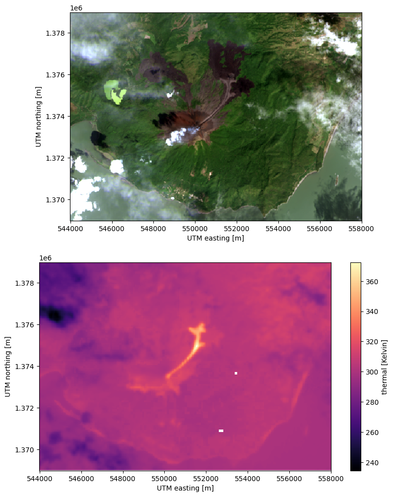
Notice that the lava flow is clearly visible as temperatures above 320 K in the thermal band but it’s difficult to see where the volcano and other landmarks are. Looking at the RGB composite, we can’t really make out the lava flow but we have a clear picture of where the volcano is and where the old lava flows are. A way to show the thermal data with the geographic context of the RGB is to overlay the two in a single plot.
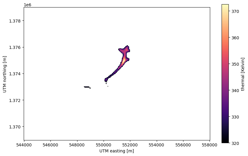
To do so, we’ll first create a version of the thermal band that has all pixels
with temperature below 320 K set to NaN (not-a-number). This is used to
indicate to matplotlib that a pixel should be transparent. An easy way to do
this is with the xarray.where function:
# If the condition is true, use the thermal values. If it's false, use nan
lava = xr.where(scene.thermal >= 320, scene.thermal, np.nan, keep_attrs=True)

fig, ax = plt.subplots(1, 1, figsize=(10, 6))

lava.plot.imshow(ax=ax, cmap="magma")

ax.set_aspect("equal")
plt.show()
Note
We used the keep_attrs=True parameter to tell xarray that it should
keep the metadata from the original band in the lava-only version. This
will preserve the information on units, procedence, etc. But be careful
with this since it can lead to metadata being propagated when it’s no
longer valid.
Now that we have an xarray.DataArray with the lava flow only, we can
plot that on top of the RGB composite and add a bit of transparency using the
alpha parameter of imshow.
fig, ax = plt.subplots(1, 1, figsize=(10, 6))

# RGB goes first so it's at the bottom
rgb.plot.imshow(ax=ax)
lava.plot.imshow(ax=ax, cmap="magma", alpha=0.6)

ax.set_aspect("equal")
plt.show()
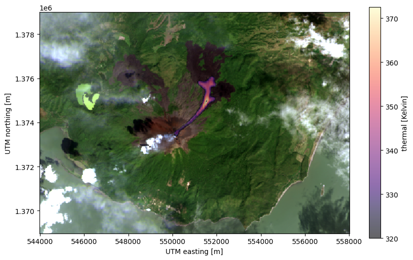
With the plot above, all of the information we have available about the lava flow is displayed in a nice format.