Histogram equalization#
Scenes with very dark or very bright spots (like clouds) can be difficult to
visualize without some sort of contrast enhancement when generating composites.
The simplest enhancement is to stretch the contrast linearly, but doing so
erases information in the very dark/light regions and won’t always work. An
alternative is to use histogram equalization, which is implemented in
xlandsat.equalize_histogram.
Let’s use our sample scene of October 2015 around Mount Roraima to demonstrate how it’s done. The tepui, as it’s called, is famous for it’s near constant cloud coverage an will make a good target for this example.
First, we’ll import the required packages and load the sample scene:
import xlandsat as xls
import matplotlib.pyplot as plt
import xarray as xr
import numpy as np

path = xls.datasets.fetch_roraima()
scene = xls.load_scene(path)
Histogram equalization doesn’t work well with missing data, which this dataset
has, and so we need to first fill in the missing values through interpolation
with xlandsat.interpolate_missing:
scene = xls.interpolate_missing(scene)
Once that’s done, we can make an RGB composite with no enhancements as a basis for comparison:
rgb = xls.composite(scene)

fig, ax = plt.subplots(1, 1, figsize=(10, 6))
rgb.plot.imshow(ax=ax)
ax.set_aspect("equal")
plt.show()
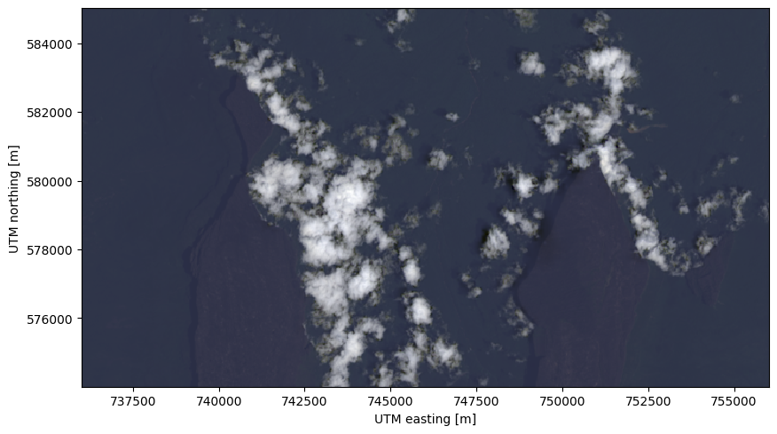
Notice how the clouds dominate the intensity range, making it difficult to make out features of the tepui and the surrounding forest.
Now we can do our best to stretch the contrast so that we can see more detail in the cloud-free regions:
rgb_strech = xls.composite(scene, rescale_to=(0, 0.28))

fig, ax = plt.subplots(1, 1, figsize=(10, 6))
rgb_strech.plot.imshow(ax=ax)
ax.set_aspect("equal")
plt.show()
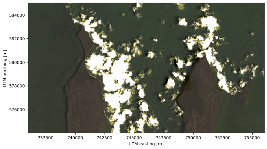
But, as we mentioned earlier, this means we don’t get to see details of the
clouds anymore. For a more pleasing image, we can use the adaptive histogram
equalization in xlandsat.equalize_histogram.
Tip
It can be helpful to do a bit of contrast stretching first, but to a lesser degree than we did previously. It’s also a good idea to use “float32” for the composite to give it a larger range of color values (but this requires more RAM).
rgb = xls.composite(scene, rescale_to=(0, 0.8), dtype="float32")
rgb_eq = xls.equalize_histogram(rgb, clip_limit=0.04, kernel_size=300)

fig, ax = plt.subplots(1, 1, figsize=(10, 6))
rgb_eq.plot.imshow(ax=ax)
ax.set_aspect("equal")
plt.show()
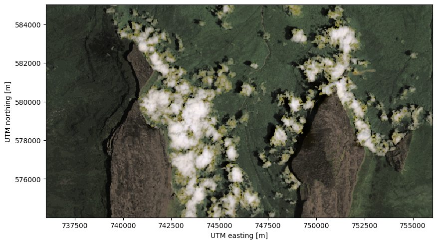
Now that’s a much better visualization, we can see details in the clouds, mountains, and forests!
Note
Notice that xlandsat.equalize_histogram must be given a
composite instead of the scene.